In the previous article, we have discussed one of the most vital segments of a successful web design: Above the Fold. If you’ve already read the article, you know how important it is and how it affects or impacts the whole conversion funnel. If you haven’t read the article yet, we would recommend you to go through it once. Now, considering your awareness of Above the Fold which is the top visible half of a web page, we are going to start conveying Below the Fold which is the part underneath. You can also call it the second vertical segmentation of your web page.
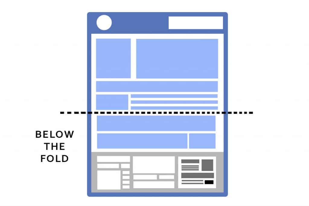
What is Below the Fold?
Basically, the term Below the Fold was also coined from the printing media when the newspapers had two halves. The top visible half is Above the Fold, the fold that comes underneath is called Below the Fold. And the same concept applies for the websites and digital media as well. It’s quite normal for a user not to stay only on Above the Fold of a website even if they like it. Actually, they will scroll down to explore more. There comes the part where Below the Fold comes into play. When users scroll down with an anticipation to discover more engaging contents, it’s your duty to satisfy his/her needs.
The less important contents considered by the website owner is placed on Below the Fold since the fold was mostly invisible on the newsstand back in the days of print media. It is still invisible on a web page when a user initially lands on the website. But once they scroll down, Below the Fold becomes immensely important and responsible for conversion. The contents below the bottom of a browser window can specifically be called Below the Fold.
Importance of Below the Fold
Importance of Below the fold may not be discovered in bare eyes or from a generic viewpoint but eventually, it plays a great role in offering you the most credible traffic and conversion.
Basically, people consider Below the Fold less important than the Above the Fold of a website which is true to a certain extent. But if you observe a visitor’s whole journey on a website, the importance of Below the Fold will be crystal clear to you. It’s wise to pay attention to Above the Fold but putting all your efforts on making the top fold look awesome and ignoring the fold beneath it will be harmful to your website.
After discovering and comprehending the Above the Fold’s content of your web page, the visitors will tend to go down to explore more. The contents of Below the Fold will have an impact on your website’s performance in terms of a long-term relationship with the visitors. The contents will be the defining factor whether or not the visitor is going to take an action in terms of purchasing your product, availing your services or subscribing to your website.
The Mobile Consideration
When developing Below the Fold of your website, you have to be careful about the mobile screens as well. Mobiles are the most used device in today’s scenario and the usage doesn’t seem to be reducing any soon. Getting out of the common 1024X768 dimension has never been easy but developers across the globe have given it a thought about the other dimensions that are mobile-friendly seeing the ever-increasing popularity of mobile devices.
As the mobile devices come with a plethora of different screen sizes, resolutions, and dimensions, it’s always difficult to design the Below the Fold for the small screen devices. Moreover, all the different mobile screen sizes come with a whole new set of limitations and requirements. Another important consideration for mobile optimization of Below the Fold is the mobile screen is displayed in portrait mode rather than the desktop-like landscape mode which is a matter of concern when the web design companies design the Below the Fold of a website.
Multiple tests and studies have shown that the mobile users are more likely to scroll down to a website than the desktop and laptop users. So, promptly, the Below the Fold of your website becomes immensely important for your website when it comes to the mobile users. You need to provide proper CTA (Call to Action) and engaging content just like the Above the Fold.
Wrapping Up
So, you have read all about one of the most crucial parts of a website – Below the Fold. While some will still prioritize the Above the Fold, our recommendation would be paying similar attention to all the aspects and segments of your website without filtering them by priority. Since a lot of traffic and conversion is dependent on Below the Fold of your website, you should start planning a proper Below the Fold or you can contact a proficient web design company like us to get the job done on behalf of you.


