If you think colors are just an additional aspect of a design, you cannot be anymore wrong! Colors are extremely powerful and influential in terms of making people feel something and doing something. If you understand the psychology behind each and every color in the palette, it will become easier for you to trigger emotion in your audience, make your brand stronger, improve conversion and sales.
According to different studies, users take more or less 90 seconds to decide whether they like a product. And the majority of the decisions depends on the color! So, it’s important to understand the color psychology in web design, which will surely help you improve branding and sales.
Color Psychology in Web Design
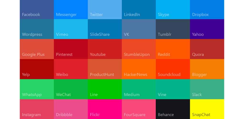
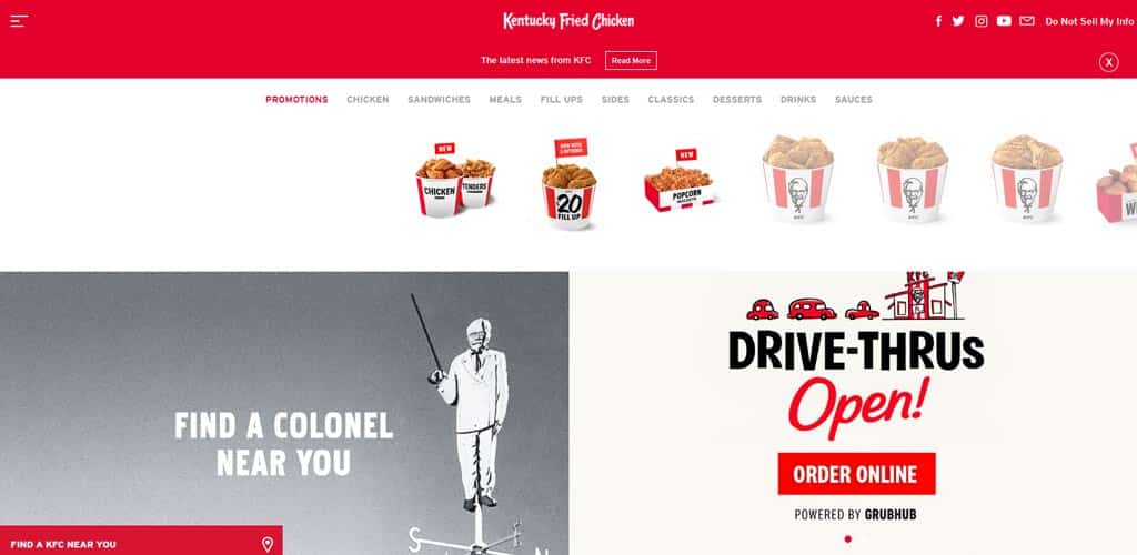
Do you think it’s an accident or a co-incidence that majority of the tech-related companies like HP, IBM, Dell, Facebook, LinkedIn, Twitter, Tumblr, and others have blue color scheme? And on the other side, most of the popular food brands like McDonalds, KFC, and others have red color in common! It’s no co-incidence. They follow a color psychology, and that helps them satisfying users and triggering their emotion. So, if you want the same response from your audience, you may want to take a look at the following psychology of different colors and use them in your web design.
The Psychology of Red
According to the researches, the color, red is proven to be a great color for pumping the heart rate of a person and causing faster breathing. Red is the symbolization of love, excitement, lust, movement, and energy. However, the color also has some negative symbolizations, such as danger, anger, fire, violence, and war!
When You Should Use Red
If you want to draw attention to something, or if you want to create a feeling of excitement, red is the color you should choose. For the industries like emergency services, entertainment, food, sports, advertising, marketing, health care, and fashion, red can be a good choice.
When You Should Avoid Red
Regardless of how good red is for creating excitement, too much excitement is never a good thing. So, you should not overuse red. If you are designing something on nature or luxurious goods, you should think about other colors instead of RED.
The Psychology of Yellow
The brightest of them all, yellow is related to youth, optimism, cheer, happiness, and competence. And it is often used in web design for its positive color psychology. Just like red and any other color, yellow also has some negative symbolizations. For instance, while expressing treachery, cowardice, and stinginess.
When You Should Use Yellow
When you need to create a sense of happiness or energize the website visitors, the use of yellow (sparingly) will be a good call to make. If you want to create a calm and content feeling, light and soft yellow is a great choice of color. Moreover, you can drive your users to CTA (call to action) buttons and text using this color.
When You Should Avoid Yellow
As mentioned earlier, yellow has some great usages but this color can strain the eyes as well as become overpowering! Using too much yellow can be a disastrous for your business as it would lead the website to reflect cheapness.
The Psychology of Orange
A vibrant, bright, and energetic color, Orange is considered to be related to excitement, happiness, fun, energy, ambition, enthusiasm, and warmth. However, this color also has another side, which signifies caution.

When You Should Use Orange
With the use of orange, one can draw the attention of the users to the CTA, sales, clearance, or some other content you want to ensure that it gets the priority and concentration. Industries like entertainment, food, ecommerce, childcare, automotive, and technology can make use of this color to create a lasting impression.
When You Should Avoid Orange
Orange can also become overpowering if you use it too much. So, just like red or yellow, you should never overuse it.
The Psychology of Green
Green is the color of mother nature, which is the reason why green resonates with balance and harmony. Green reflects the feelings of nature, calmness, growth, wealth, health, money, generosity, masculinity, good luck, fertility, peace, support, harmony, energy, and envy.
When You Should Use Green
Scientifically proven, green is the easiest color human eyes can process. If you want your audience to feel relaxed and calm at any point, green is the color to use. Also, for reflecting new beginnings, wealth, nature, or energy, you should pick green. Moreover, if you are working for any of the industries like human resource, tourism, science, medicine, sustainability, or environment, green will help you craft a better design with more appeal.
When You Should Avoid Green
While green almost goes with everything, when it comes to technology, luxurious goods, or something dedicated to adolescent girls (generally), green becomes less significant.
The Psychology of Blue
Quality, dependability, calmness, masculinity, wisdom, competence, loyalty, trust, productivity, security, and strength are some of the qualities that can be signified by using the blue color. Moreover, using the bright blue color can also reflect energy and refreshment.

When You Should Use Blue
Banks and large organizations often make use of blue because of its non-invasive nature and its association with trust, loyalty, and dependability. Apart from the banking sector, blue is a suitable color for the technological, healthcare, medical, dental, government, science, utilities, and legal industries.
When You Should Avoid Blue
Blue also represent coldness and death. That is the reason why it is unwise to use the darker tone of blue or using blue too much because it would make your users feel a certain kind of coldness and uncaring vibe from your site. You need to be extra careful if you want to use this color on a website or app related to food because blue may restrain appetite.
The Psychology of Purple
Purple is another color that will surely be discussed if the topic is color psychology in web design, thanks to its huge usage. To put it simply, purple is the color of royalty. However, you can also see further usages of purple to communicate various other emotions and qualities, such as sophistication, authority, prosperity, creativity, wealth, mystery, power, wisdom, respect, and imagination.
When You Should Use Purple
If you want to create a feeling of luxury and wealth, using dark purple is a good idea. ON the other hand, light purple will help you create an ambiance of romance and spring. Purple has further use when you want to use a color for beauty products (anti-aging, to be specific), yoga, massage, healing, astrology, spirituality, feminine brands, and something related to girls of adolescent age.
When You Should Avoid Purple
If you want to grab the attention of your users, purple would not be a great choice because it is considered to be a calming and soothing color. And on the other hand, if you use darker and deeper purple, it would make your website feel distant and aloof.
The Psychology of Brown
If your website is somehow related to ruggedness, earth, stability, reliability, nature, and friendship, brown is the color to pick since it is a natural and warm color.
When You Should Use Brown
In order to arouse appetite, brown is a great color. If you are unsure, think about those advertisements of coffee and chocolates! And this makes brown an outstanding selection for food-related (specific food items) designs. Moreover, the websites related to real estate, finance, veterinary, and animal can also use brown. Brown also has an outstanding usage of being a background color.
When You Should Avoid Brown
Brown can become boring! If your target is to grab the audience’s attention, you should think twice before using brown. And this is the main reason why you should never use brown on your CTA button.
The Psychology of Black
The qualities reflected by the color, black are elegance, sophistication, authority, sleekness, power, strength, stability, intelligence, and formality. However, just like any other color, black also has some negative symbolizations, which are mystery, death, rebellion, and lastly, evil.
When You Should Use Black
Using black can quickly enhance the website’s elegance, depending on the color it has been used with. Alongside the elegance part, black is also superlatively useful to bring out an edgy, modern as well as traditional feeling. Websites, advertisements or an image related to cosmetics, marketing, fashion, and luxury goods can use black in their favor.
When You Should Avoid Black
It can promptly become overwhelming if black is used too much! Also, it cannot be forgotten that black can also reflect the feeling of evil and menace, which can bring discomfort for your users. When it comes to nature or travel related websites, black is a complete NO.
The Psychology of White
The next color in our discussion of color psychology in web design is White. The white color symbolizes cleanliness, purity, virtue, sincerity, safety, and happiness.
When You Should Use White
If your website is related to healthcare or medication, white will be the absolutely best choice as you can see the doctors and nurses wearing white clothes. Well, not only the healthcare industry, but the scientific and high-tech sites can also use white as their color. White, when paired with grey, silver, gold, or black, can bring out the luxurious feeling, which is an important point to be noticed.
When You Should Avoid White
Unlike any other color in the palette, there is nothing where you cannot use white because it is meant to be used with another color. So, the entire choice depends on the other color while white stays as a support system.
The Psychology of Grey
When you think about a website or an image in grey color, you’ll certainly get the feeling of timelessness, professionalism, formality, practicality, character strength, and sophistication.
When You Should Use Grey
If you want your website, advertisement or image to reflect professionalism, calmness, balance, or luxuriousness, grey would be a nice color to choose among the others.
When You Should Avoid Grey
Just like brown, grey is also not a great color when you want to grab the attention of your audience. Some shades of grey can bring out the feeling of detachment, dullness or it can even seem cold!
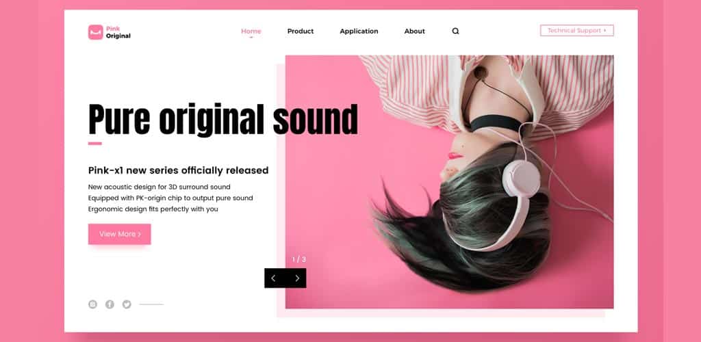
The Psychology of Pink
Despite being a tint of red, Pink has some strong associations with a lot of qualities that go beyond red. Love, romance, sincerity, and sophistication are four top reflections of Pink. Since it does not have the angry and violent parts of red, pink can be an outstanding color for representing something gentle and soothing.
When You Should Use Pink
Not intending to discriminate any gender, but pink works exceptionally well for the feminine contents and products, or the websites that are focused on young girls and women.
When You Should Avoid Pink
Light pink and bright pink both can make things a little difficult for you since the lighter tone seems too sentimental and the brighter one may get loud.
Conclusion
The web world is vast. And so is web design. Each and every little aspect would matter, and can be decisive when it comes to attracting and impressing your audience. The color psychology in web design may not be followed by many, but if you follow the psychology, you can get the upper hand over your competitors. Since users don’t see or meet you directly, it’s all about stimulating their emotion. And the use of colors can make it happen without any issues.