Simplicity always makes sense – it’s not only us who think that. Even the great Leonardo Da Vinci stated it way before, “Simplicity is the ultimate form of sophistication.” Well, we are referencing Da Vinci’s quote not only to make the article artistic but the statement also strongly applies to the UI (User Interface) Design.
If you want to attract, convert, and retain the users on your website, there are three criteria that are needed to be met by your website’s user interface – the user interface should be attractive, engaging, and prompt the users’ buyer persona.
The same theory applies to every other artwork as well. The only difference that takes place is that the UI should always be simple but the art can be complex (according to the artists’ vision).
UI is one of the most significant segments of the user experience of a website and the UI is also a considerable factor for influencing the conversion rate.
Conversion, on the other hand, is the end result of a successful journey of your website visitor on your website. As per the words of Harvard Business Review, the successful journey is synonymous with the reduction of efforts. Nowadays, customer psychology is entirely different from what it used to be. The customers of the modern time do not have much time or patience to climb a mountain to obtain any service. They have a boatload of options where they can avail the services from. Below are some handpicked statistics that advocate our statement.
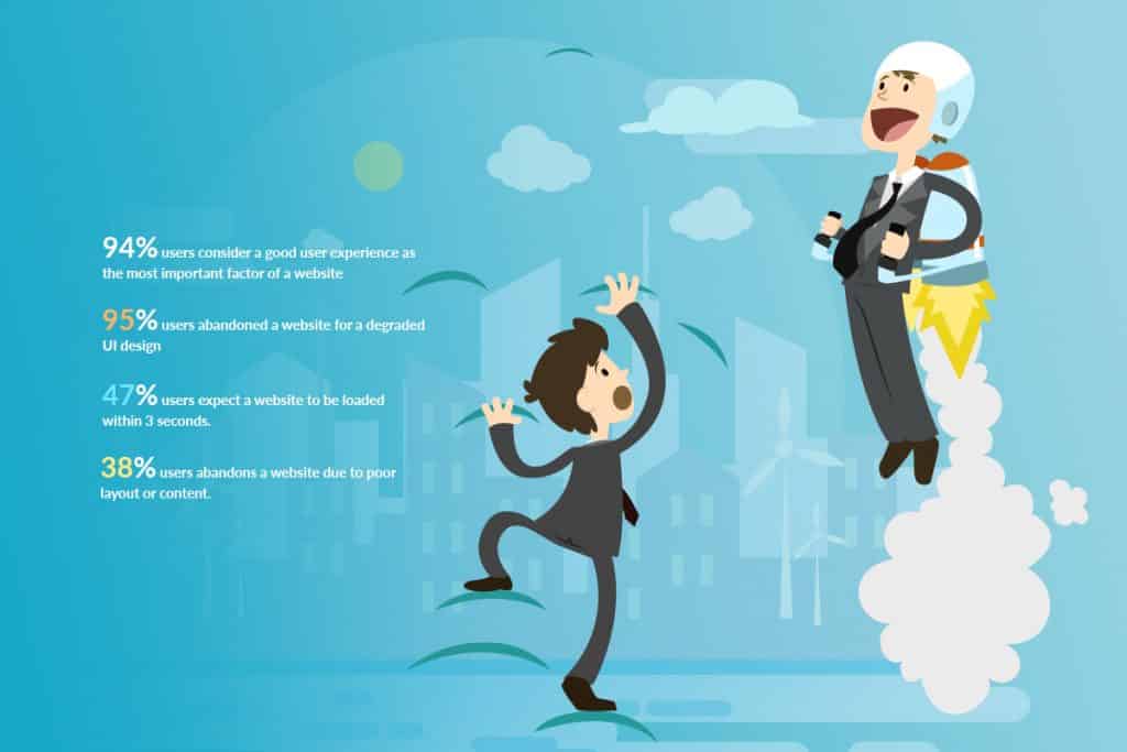
- An unattractive content or layout is the reason for 38% of people leaving the site.
- Three seconds or less is the expected loading time of a website for the users.
- Good user experience is the prime aspect of any website, stated by 95% of internet users.
- A website will be abandoned by 94% of the individuals if it doesn’t meet the designing standard or the design degrades.
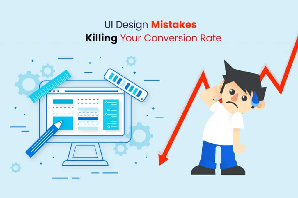
Dull design, slow loading time, and complex navigation or hierarchy are the three most lethal elements that can murder your website’s conversion rate. If your business’s survival depends on the conversion rate of your site, the UI would certainly become an immensely vital factor that can make or break your business, growth, and scale. And there are certain UI design mistakes that can hurt your conversion rate badly and turn your business upside down. We are listing such 10 common UI design mistakes made by a lot of business owners and designers.
10 UI Design Mistakes That Hurt Your Conversion Rate Badly
Without further ado, we are going to start the article. After going through the article, you would understand the exact aspects where you were making mistakes. And you can take the required action based on our evaluation and suggestion.
Unresponsive Design
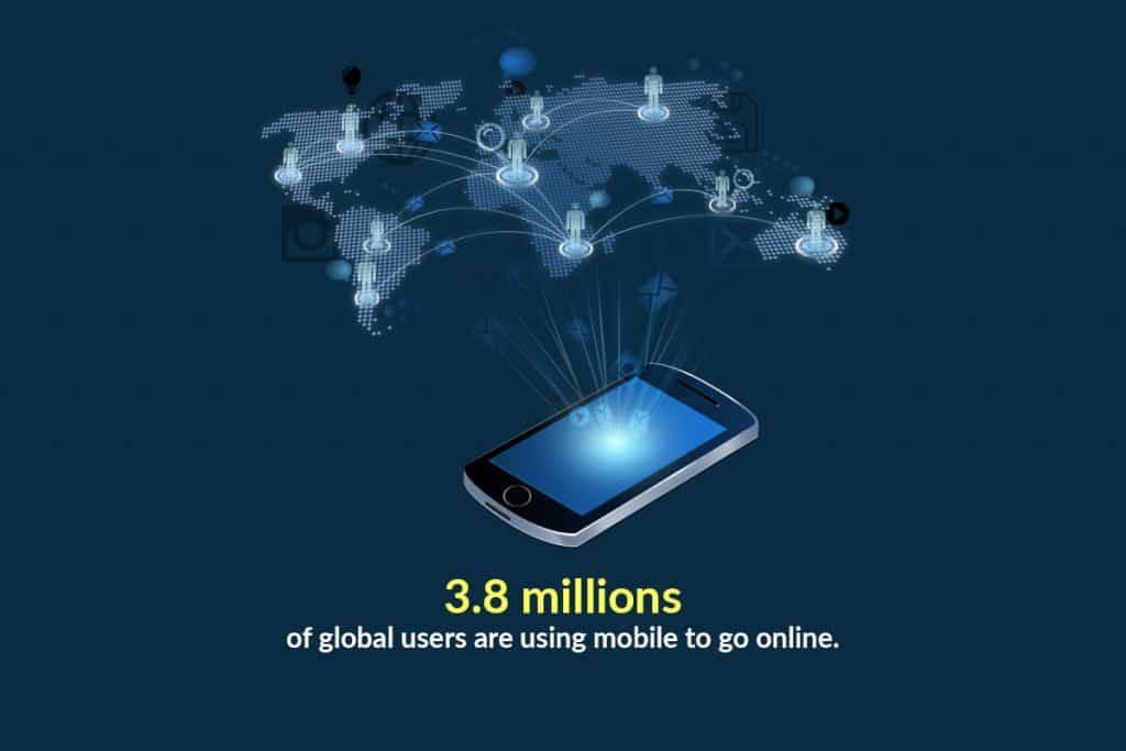
These days, mobiles are the most adored device even for accessing the internet and websites. Furthermore, globally 3.8 million users are making use of their mobiles to go online, as per the reports of April 2018. Now, if the users don’t find the best features of your website accessible enough on their small-screen devices, they will simply leave. A responsive design comes handy in making your website design stand tall in all the screen sizes and resolutions across each device.
But the growing number of mobile users is not the only reason for prioritizing the responsive design! Google released an algorithm in February 2015 that ranks the mobile-friendly websites higher on the search results. Thus, responsiveness is a necessity at the moment, rather than an option. The change in the user behavior clearly signifies the Google recommendation and the explosion in using mobiles.
An unresponsively designed website cites a poor user experience (UX) which will make your customers turn to some other website instead of sticking to yours. The effort would be added instead of being eliminated.
Complex Navigation
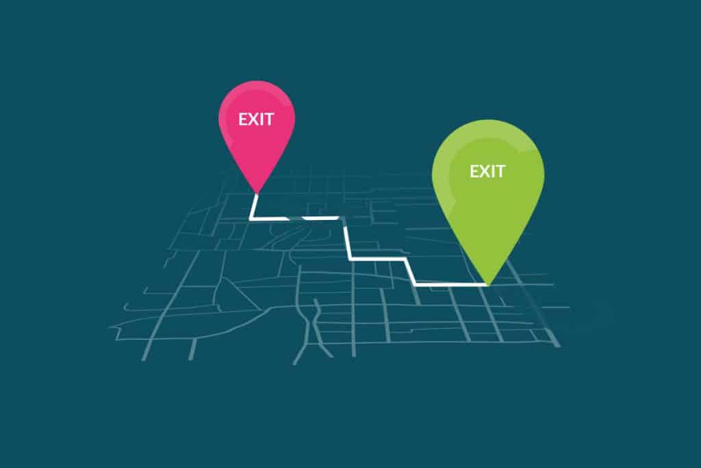
Since now, you have read the above points and cleared the clutter in your website, it’s time to organize the remaining elements in the most efficient manner. There are two aspects that require your attention – navigation and hierarchy.
We have previously discussed the navigation and hierarchy in our detailed web design guide so, you can assume the importance of it. Hierarchy creates a pyramid that depicts the arrangement of the most important and the least important elements of your webpage. Quite naturally, the most important element would always be listed at the top and the least important elements will be at the bottom. Thus, the lack of hierarchy would make your website vulnerable for the users.
Each of the headings on your web page should depict a certain statement, subheadings should convey to the users how they are going to be benefitted, and the description should be kept in a logical order.
Now, when it comes to the navigation, it should always be placed at a location where the users are expecting it to be. The navigation should be crystal clear and placed either at the top (horizontally) or on the left side (vertically) as the vertical sidebar. The items on your menu are preferred to be kept within five or six.
You need to remember one thing – you merely have one or two seconds to convince your customers to avail your products or services, a properly crafted navigation would always be important in order to have them feel comfortable and get convinced eventually. If the navigation is found intimidating or confusing, your consumers are never going to stick to your site (at least in the modern scenario).
Cluttered Layout
Being a designer, you may love the creative mess you’ve created but the users will certainly not appreciate the clutter in the layout. So, it’s time to think like a user and leave your arbitrary mind out of the door.
When the users would find too many elements on a website that are equally asking for their attention, they would feel extremely confused where to go and where not! This will simply add the efforts which are needed to be diminished! Since the potential consumers don’t have any idea of where to look for, they can miss your exciting offers or the CTAs. And the result will end up having them slip through your fingers.
Conversion is the common destination where the website owners want their website visitors to lead. Your website visitors land on your website for searching for some product (remember, they don’t always have the idea of what they are looking for). So, they are going to search for the product(s) till the moment they get frustrated. And if they get frustrated, they are not only going to leave without making a purchase but they are also not going to come back to your website anytime sooner. We are mentioning the tricks to avoid this issue.
- Your landing page should contain a few components – CTA, primary headline, hero image, a summarizing list of the advantages of using your products or services along with the social proofs to augment the trustworthiness in your statement.
- Each and every page on your website should carry only one objective. The focus on one action would explain and stimulate the users to take the necessary action without creating any fuss.
- When it comes to the eCommerce sites or any site that includes a product page, make sure that your webpage’s CTAs, images, product descriptions, and forms have a certain amount of white space between them.
- The design scheme you are choosing should never contain more than three colors and a maximum font type of two.
In a nutshell, when you are dealing in the world of websites for conversion, make sure that you are keeping the usability prior to the aesthetics. Ultimately, the usability is something that is going to bring you the consumers.
Generic Image (Stock Images)

Stock photos are despised and there’s a fair reason behind that. The stock images are awfully fake and it can be noticed in bare eyes!
As you must already know that the marketing and branding of any website are greatly impacted by the visuals. The visuals are the medium that can make a website visitor relate to the happy and smiling face of a satisfied customer on an image of your website. It will certainly add to the tone and mood of your website. Talking about the mood, the only mood a stock photo can create is the mood of distrust.
You need to always remember that the stock images portray a falsehood. When your website visitors land on your website, they are rummaging for a particular product or service and they want to believe you. But when they find a fake image welcoming them right after they land on a site, that obvious lie hurts them badly. It is a universal fact that the website imageries should always enhance the confidence of the users as well as engage them. Only an authentic image is capable of doing so.
We are going to depict a clever trick to have great images on your site. You can make use of the hero images which is capable of directing your visitors’ attention to the CTA. An effective way of doing that is positioning the subjects of the image look towards the CTA! When it comes to the models, you should always aim to have the individuals who would epitomize the persona of your website’s ideal buyers. All these would be a catalyst to inform your website visitors that they have landed in the right place.
Poorly Built CTA (Call to Action)
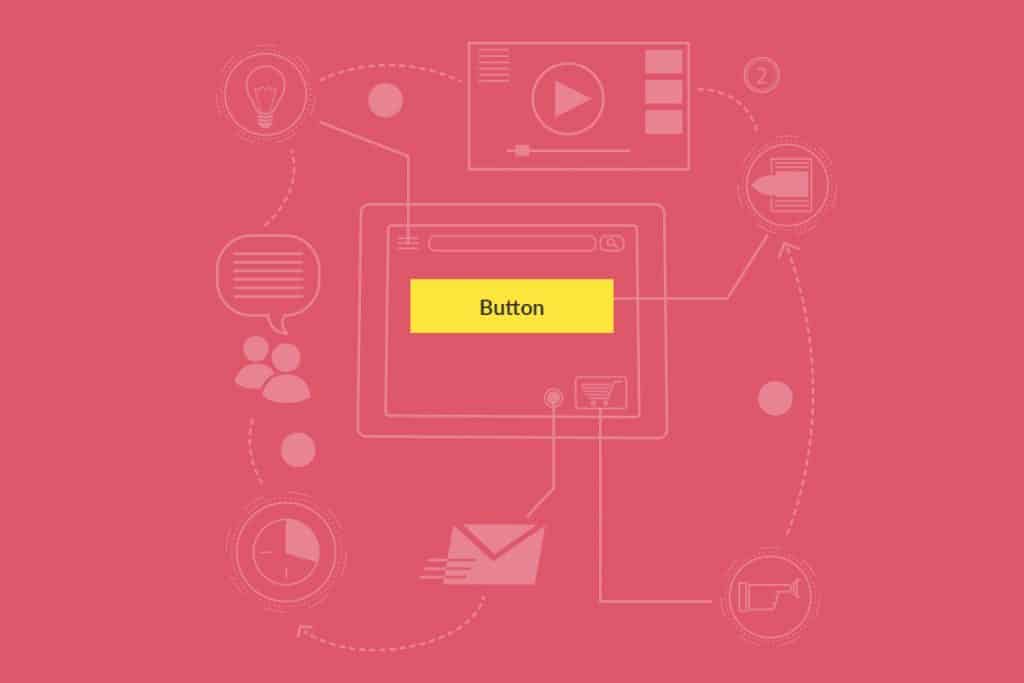
CTA is one such thing that packs all the conversion power of your web page into one single button. Thus, the CTA becomes immensely important when it comes to the conversion rate. Each and every aspect of your CTAs (from the color to the copy) should clearly convey to the users that it is clickable and they should click on it. However, this is the point where people make the most lethal mistakes since they don’t pay much attention to the CTA which results in a horrible outcome. So, we are explaining the important features that you should consider while creating your CTA.
- Design: CTAs are all about grabbing the attention of the users but it doesn’t denote that the CTA button should glitter all of a sudden. You need to keep the design simple but appealing.
- Color: Color plays a pivotal role when it comes to the CTAs. The color should always stand out tall from the background color and have the users’ attention.
- Shape: Generally, the CTAs are shaped rectangular with a fair amount of white space surrounding it. Now, having said that, you may use other sorts of shapes (round or oval) but make sure that fits with your overall page design and nature of the website.
- Size: The size of your CTA should be balanced. It should be small enough to be inviting and large enough to grab the attention of the users.
- Length: You should not use more than 60 characters when it comes to the CTAs. The CTA copy should be short and crispy.
- Language: CTAs are all about creating an urgency among your website visitors. Therefore, making use of the active verbs, first person, and the timing words would be the finest thing you can do.
- Location: A CTA button should always be following the proposal you have given on your site. Place your CTA right after a proposal.
Having said the above, your website’s CTA should always follow the audience’s psychology. Their way of thinking and purchasing behavior would come into play when you are going to decide the above features of your CTA. Now, the final advice to you is that you should find the perfect blend of the features and test your CTA multiple times before making it live. If you find the perfect balance, loads of conversions are waiting for you.
Lack of Social Proof
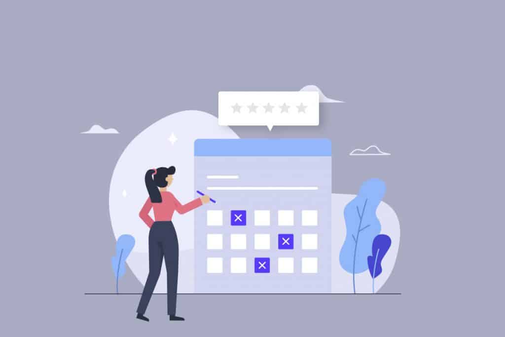
Well, if the hardcore UI design is concerned, the testimonials, user-generated contents, or customer feedbacks would not be considered as the vital elements. But each of your relevant web pages should contain those social proofs of your excellence. The social proofs become immensely vital for the conversion and branding of your website. This directly denotes that nobody can plan a website design without having the social proofs integrated.
The lack of social proof clearly denotes that your services or products don’t have any credibility. When the credibility won’t be there, your website visitors would certainly not be willing to stick to your site as they are not going to trust you without any social proof. Thus, your branding, SEO efforts, and marketing value – all get hurt and the result comes up as the reduced conversion rate. In fact, a whopping 70% of the online buyers never make a purchase without having a look at the review!
With the real messages of the real customers, your worried prospects are going to have a sigh of relief. This is such a technique that has the capability of providing you with more conversion rate than the product description or CTA can offer. Well, it’s not our words, the analytics and statistics say that. It has also come to notice that reliable customer reviews are 12 times more trusted than the finest sales pitch.
Boatload of Texts
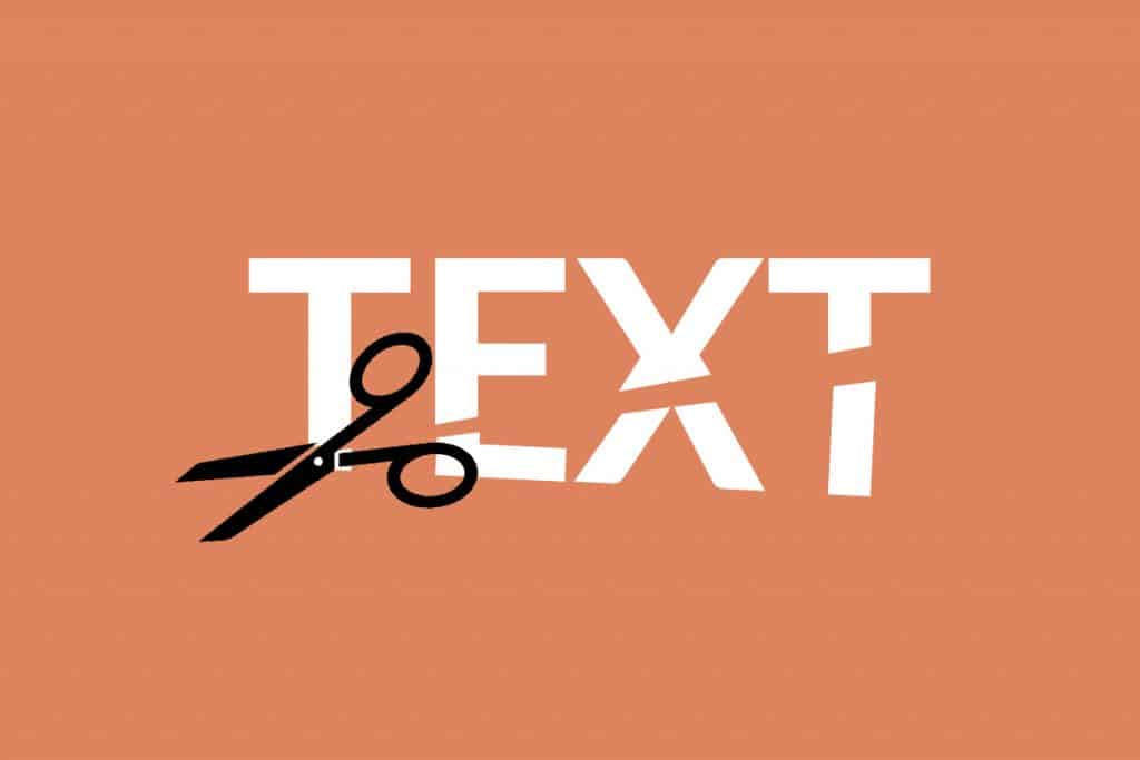
You would be surprised to know that the majority of the website visitors do not read the contents, rather they would comb through it. Basically, if you think the users would scrutinize each and every word of your website contents, you are living in a fool’s world.
Having too many texts on your web page would not serve any purpose other than overwhelming the visitors or distracting them from taking the action you want them to. You must be fascinated to brag about your products and services and add countless texts and keywords in the description depicting their awesomeness but there is a ‘blog’ section for doing so.
As already mentioned earlier, the idea should be saying a lot by writing the least. You should always write the contents of your website considering the emotional and in a thoughtful manner. Take time while you are writing. Keep improving the content until it becomes concise but convincing. With regular practice and improvement, you will be able to express the words in a way that they hit the sweet spot of the readers’ mind.
Increased Page Loading Time
As per the studies, 47% of the individuals across the world expect a web page to load within three seconds or less! Well, don’t be surprised right now, there are more to come! The study also conveys that there will be an abolishment of 11% page-views, 7% conversions, and 16% customer satisfaction. Moreover, the search engine ranking on both desktop and mobile is severely affected if the web page loads slowly.
You should put yourself in your users’ shoes to evaluate the whole matter honestly. What would be the chances of you trying to access a site again that does not load quickly and keeps you waiting? Quite frankly, you would never come back later on the site as going for the first competitor would seem the best option for you to avail.
Thus, you should always make sure that your website enjoys a good amount of loading speed. Below are the tricks to speed up your website. Have a look.
- Reduce the HTTP Requests
- Optimize Image Size
- Reduce the Number of plugins you are using
- Reduce the Redirects
So, we believe you have understood the whole scenario and how to reduce the website loading time. It’s time to have a blazing speed on your site. If you want to dig more into the topic, visit our detailed article on website speed optimization.
Force the Users to Think
The simplicity of the UI design has already been discussed earlier in this article. It has been mentioned that simplicity is one of the prime characteristics of an effective UI design. “Don’t Make Me Think” is a famous book written by Steve Krug which set a standard for the designers. The name of the book itself is quite self-explanatory. When it comes to the succinctness and intuitiveness of your website’s UI, any needless element or unnecessary step denotes added effort.
Since every path of the internet and business world meets at the same destination, called conversion, making the shortest route for the users towards the conversion would be the smartest thing you can ever do. Thus, you should always stimulate your website users to take the right action and make a purchase. Your sole duty is abolishing the time of their thinking. Now, the more time a user gets to rethink his/her decision, the less chance you have for getting them converted into a successful consumer. The slightest dose of a headache would make them leave your site.
The secret to a successful UI is making the user journey as smooth as possible. Thus, creating a design that makes a visitor think fits well with the artworks but when you are stepping into the commercial world, you should always think simple and design simple.
Designing for Yourself
Indulging yourself into the website design is one of the most common and lethal mistakes you can ever commit. As you are a designer, it’s expected that you would maintain and follow the rules set for the user-friendliness and an effective user experience. You can go creative and let the juice flow freely only after ensuring that you have followed and maintained all the rules that we have mentioned above.
But one thing that you need to bear in mind is that you are not designing a web page for yourself, rather the page is being designed for the millions of users. The users share the same preferences, interests, the pain points of an ideal buyer. Therefore, you need to work closely with your sales and marketing team in order to identify the finest designing approach. Wireframe the most challenging UI aspects which would give you a great exposure. Keep testing till the moment you have a good feedback.
Winding Up
It’s quite certain that the UI would come with a lot of hurdles but those can be overcome. And overcoming those odds takes you to the perfection. Below are the aspects you need to follow!
- Create a clutter-free website where your contents have some room to breathe.
- Create a website that is superiorly functional and easily accessible across all the devices.
- The navigation of your website should be immensely intuitive and simple.
- Images used on your site should always be relatable and authentic.
- The CTA on your website should be engaging and actionable.
- Always keep some social proofs on your website.
- Use fewer texts and say more. Make use of the actionable words that can engage a user.
- The website loading time should always be within three seconds.
- Don’t design for yourself, design for your prospective clients.
- Don’t force the users to think too much. Let them perform the action you want them to.
So, follow the above pieces of advice and implement them while you are designing the UI of your site. The effective implementation would certainly boost up your website’s conversion rate and you are going to see an upsurge in customer satisfaction. Also, write us back with your feedback regarding the article. Mention the points we have missed to mention.