Landing pages are something that can upgrade or downgrade your sales. While a well-designed landing page can upsurge your conversion rate and overall sales, a poorly designed landing page would do the exact opposite by discouraging the visitors from taking the required action. So, it is very important to design your landing page properly, keeping the customer requirements and marketing communication in mind.
There is a great possibility that your visitors would leave your landing page within three-five seconds after they open it. So, it’s your responsibility to design the page well enough that it meets their expectations.
Here, in this article, we are going to discuss the biggest and the most common landing page design mistakes repeated by the designers across the globe. Also, we will talk about the best landing page design practices that would help you get better response and result.
So, let’s go…
Common Landing Page Planning and Design Errors
Not prioritizing the landing page design is quite common and that is the reason why a number of mistakes are made while designing one of the most important pages of a site. So, let’s take a look at the most common landing page design mistakes and errors.
Messing Up Headlines
When your visitors come to your website, the first thing that they are going to notice is the headline. However, often we find the headlines surrounded by messages that are of interest to the visitors. And that’s how the designers make their first blunder. As a result, the design (and the site) fails to convey what it is all about.
Your headline should say the same as to your promotional campaign, which would inspire site visitors to explore further. This applies the most when you’re launching a landing page for publicity purpose and your visitors are coming to find information about discounts and such services.
Serving Lots of Goals
Commonly, amateur marketers and designers put every single thing that they can think of on the landing page, wishing to pleasing all the clients with everything. However, that ends up setting excessive goals for one page, and lacking specific aim. You need to understand that when you are showing your visitors too many products or services, alongside offering them options, you are confusing them. And visitors did not land on your site to get confused. Your aim should be offering the best thing you have and convincing them to buy or subscribe.
If you have a wide range of audience and products/services, you should go for multiple landing pages for multiple purposes, instead of including everything in a single one.
Weak Layout
On a general note, three things are there that communicate with the visitors of your landing page: CTA, Image, and Content. Now, if you put unnecessary or excessive content, which makes it harder for your visitors to find out the things they want would do nothing but lowering their interest level. Your landing page is one of the most (if not the most) vital aspects of your website for sales. And designing a landing page without proper strategy and goal is the biggest landing page design error.
Moreover, when designers add excessive CTAs (Call to Actions) and navigation options, that turns out to be a new reason behind landing page design errors. It’s simple, adding too many navigation options would take your visitors farther away from taking the action you want them to take.
Complicated Form Filling
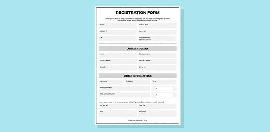
The main purpose of landing pages is to generate leads, gaining subscriptions, and promote trial versions. All of these demand for a form that the visitors fill, which is a pretty common conversion process. Now, the mistake that many designers repeat here is they create a long and complicated form that asks too many questions (that are unnecessary and redundant), which confuse and irritate the visitors. It involves a lot of hard work to get significant visitors to your landing page, and you should not lose any of them just because of a complex form!
Non-optimized forms not only are difficult for the users but they can also kill the purpose of the business. It has been noticed that even an addition of 2 or 3 additional fields has caused losing leads. Moreover, you should also keep the form visible enough for the busy visitors to find out immediately. The harder it is to find the form, the harder it becomes to get conversions.
Impractical Links on Footer
Inexperienced designers and marketers are often noticed to repeat the same mistake of adding too many links on the footer. Footer is the place where your website visitors would like to find the vital information they could not find above. So, you should not create any chaos there in order to keep it simple for them. Only keep some important links and whatever you feel is vital for your audience.
In case of a landing page that has a specific goal or target, it is recommended not to have even a single link at all on the footer. This kind of landing page also needs to be fully detached from the core website, eliminating the navigation bar at the top and all the links from the footer.
Since now you know about the landing page design mistakes, let’s move ahead to the best landing page design practices that could help you climb the ladder and get more conversion and leads.
Best Landing Page Design Practices to Follow
The first and foremost rule of a good landing page design is focusing on the business objective and psychology of the visitors. The entire design should be planned as per the consumer behavior in order to make it engaging at the very first glance. So, let’s have a look at a few landing page design practices you can follow to get conversions.
WIIFM Principle
WIIFM (What’s in it for me) principle should be your primary concern. You need to decide what’s there in the design for your consumers. Thinking from the consumers’ viewpoint would help you design the page in a way better manner. Once you understand what your consumers may want (or require), you can provide the information on the top fold of the page in the form of heading, subheading, explainer video, and body content.
Moreover, your landing page should be able to convey the benefits that your products/services offer within the top fold so that visitors are encouraged to take the required action. They secret to success here is to be as precise and persuasive as possible.
Write the Copy Well
You should not blindly plan the content. The entire content of your landing page should be planned according to the specific buying behavior and preferences of your target audience. Your landing page content should be powerful enough to encourage them to take a positive decision, which is the secret to success in terms of landing pages. In order to do so, here are some tips you may follow:
- The headline and associated tagline should be written perfectly.
- Do not use big paragraphs where visitors may feel lost. Instead, use bullet points something similar.
- Keep the display clean and catchy, which would inspire visitors to go through the conversion.
- If there’s a lot to explain or say, do not use chunks of texts. Rather you may include a video that will get the job done effortlessly.
Landing Page Should Be Self-Sufficient
A landing page is different from the homepage and other inner pages of any website. That’s because not only do they just share information, but they are also designed to produce quality leads. However, if your landing page has any different purpose other than what we have mentioned, that would work differently as per your requirement. The navigation and conversion options of your landing page makes it work differently. Here are some tips to make your landing page self-sufficient.
- Do not use a navigation bar that would give a direct access to your whole website.
- Keep only one optimized CTA that would help in the conversion process.
- Do not put any secondary links or CTAs that would involve multiple options for the visitors and create confusion.
- The landing page should contain a conversion form in order to prevent diversion to RFQ form or contact us page.
- Do not keep any links on the footer that would create a secondary navigation.
- Keep one visible option to go to the homepage to ensure that the visitors are not feeling trapped.
Following these tips would help you keep the visitors longer on your landing page and get more conversions.
Plan CTA Properly

CTA or Call to Action is the most important aspect of any landing page. You have to keep a clear and concise CTA, which will convey what a visitor will get if he/she opts-in. Everything regarding the CTA would matter – from the color to the copy, size, and design. You need to ensure that the CTA of your landing page is distinctive from the other elements. This is to ensure that visitors do not have to look for the CTA. If you are not sure how to create and optimize your CTA, here’s our CTA guide you may take a look at.
Social Validation/Proof

Social validation or proof has become one of the most important factors while dealing with online audience. Before using a new website, visitors would like to read reviews and testimonials (in case of a service-based landing page) of other customers for the sake of authentication. Keep testimonials of reputed clients and high-quality works, which would instigate the visitors to believe in your company. Everything is about creating a trust-factor for your business.
Conclusion
Landing page is one of the most important pages of your website that helps in generating leads and conversions. So, you cannot afford to make mistakes while designing your landing page since it would directly affect your revenue and sales. We believe our inputs have helped you understand how to design landing pages without repeating any common mistakes.
If you still need further assistance, we are always available to help you out. You can contact us through email or phone any time for an expert advice.