They say, ‘The first impression is the last impression.’ And let us tell you, they are undoubtedly right. You will get a single solitary scope to build the first impression. When the topic revolves around the websites, the first impression builds when the users land on your website’s homepage. That’s why the top tricks to design a homepage is the hot topic in the current scenario.
The homepage is regarded as the most important web page of all, considering the fact that users will land on this page for the first time in most of the cases. Therefore, if you don’t have a well-designed homepage, you can lose your website visitors without having them converted.
The question remains, are those dissatisfied visitors ever going to return? 99% chances are negative! Well, according to the researches (conducted sometimes ago), 94% of the overall first impression of the users on a website is connected to the design. That says it all why we need a good homepage design. We are going to provide you with the best homepage design tips with some examples of great homepages.
With our tips and tricks, you are going to have all the knowledge of creating an immensely functional, intuitive, simple, and easily navigable homepage design. People will fall in love with the designs and end up coming back to your site to avail more services or products when they will be in need. We are also explaining below why you need a good homepage design.
Reasons for Having a Good Homepage Design
Unless you are running a paid campaign (like Google AdWords) or a blog post is found in the search result, your website visitors would most likely land on your homepage. In that scenario, your homepage would play a pivotal role in defining your business’s destiny. On top of that, if you are suggested to have a look at certain company online, you are going to type the company’s name on Google and the homepage would be the foremost thing to pop up. But it may still not be clear to you why, exactly, your homepage matters the most. Let us explain you below.
1. Branding
Who doesn’t know that branding takes a business to the height of success? So, you need to make your business’s branding stronger. It’s quite similar to the wrapper of a product – if the wrapper is dull, doesn’t have any engaging picture, or doesn’t glitter enough, the first impression of the product will always be negative. If the wrapper is shining, has an attractive color combination, and a catchy label, you would, quite surely, end up buying the product.
So, having a good homepage means strengthening your brand prior to anyone even makes any detailed query. Thus, you should come up with a homepage that reflects your expertise and efficiency along with a clear indication and portrayal of your brand. Right from the color palette to the logo, and contents, everything should be prioritized and showcased.
2. Offer and Value of Your Site
Your website’s curb appeal is provided by your homepage along with a hint of what’s inside. The homepage should convey to the users regarding what they are going to get after digging more.
If you put your statement straight, it will be easily comprehensible for the users what your website’s niche is. If you deal with the products or services, feel free to state those clearly. Give a reason to the visitors to learn more about your business.
Suppose, if you want to offer the users a website design and development service, it would be perfect to directly say, “Do You Need A Website? Get It Done from Us.” Therefore, the users would also be able to understand what you are offering and how they will be benefitted. Also, such clear words will be tempting and reliable since there’d be nothing distracting for the users.
3. Easing the Visitors
When it comes to ease your website visitors, your homepage will play the most important role in doing so. The homepage will help you lead the users to the further pages of your site. Whether you want them to click on a particular link, check your blogs, or filling out a form, each of the actions will start from the homepage.
When your visitors roll out of the mat on your website, it’s your responsibility to present the value to those potential customers. It’s immensely important as this would help them understand what they should do next. This is an important aspect to have the users stuck to your site. Not a single example of the best homepages would take out any obstacle in front of the users.
4. Often Homepage is the Landing Page
Once upon a time, there used to be a fine line between the homepage and a landing page. But with time, the line has been blurred. While the motto of the landing page is to convert the visitors into the customers, the homepage serves the same goal too! Thus, if you want your website’s homepage to behave and act like a landing page, you need to make it like one.
If your homepage is supposed to act as a landing page, some distractions are needed to be removed. At least the Above the Fold of your website should look clean. If you have a look at the neilpateldigital.com, you would be able to understand the smart trick applied on the homepage in order to make it look like a landing page and turn it into a conversion machine. You would find the navigation links but they are quite unobtrusive and less attractive than the heading and CTA.
Top 2 Homepage Examples – Reasons Why They Work
So, now you have the idea of the reasons to have a great homepage. Now, it’s time to look at the finest examples of the homepages available on the internet. We would like to mention that you should not copy the designs but you can be inspired, motivated, and conceptualized by those designs in order to make yours more efficient.
1. Uber
You must be familiar with Uber if you often book cars to move from one place to another. Some people even book Uber rides despite having their own car, given to the efficiency of the Uber drivers and the fact that you don’t have to drive yourself. But today’s topic isn’t about how wonderful Uber rides or drivers are. It’s about the homepage and undoubtedly, the Uber homepage is one of the most cherished homepage designs that can be found online. We are crowning the site as one of the most well-designed homepage-containing sites since it offers a wonderful amalgamation of having a safe ride and becoming a driver along with various other services apart from the cars.
Reason Why It’s One of the Best
Paying an attention to the elements of the Uber’s homepage would make it clear to you that each of the elements creates a funnel on the website which helps the visitors take the right actions one after another. There will be two options placed alongside which are exactly opposite to each other! One tells you to book a ride and one asks you to be a driver and earn money.
You also need to observe how trickily they have chosen the picture on the homepage. If you scroll a bit, you would see a picture showing a guy behind the wheel who’s clearly depicting an Uber driver and a lady who’s, considerably, a rider (consumer). When you, as a consumer, are going to book a ride and see that image, you would find that smiling and satisfied face of the lady inducing enough to build a trust in you. On the other hand, if you want to be signed up as a driver, the polished look of the driver would certainly make you feel happy that you are going to the right place to earn bucks.
Also, the rest of the website offers important information in large icons and texts but in an engaging manner. Also, they have cleverly listed their other sectors of dealing apart from the car riding and driving.
2. Copyblogger
You would find almost nothing on the website of Copyblogger. There will be a white space and a block of the image along with a heading containing two lines of texts. The site is extremely minimal and simple without any inclusion of the hero image or boatload of texts (especially, on the above the fold portion). After scrolling down, the blogs will be found listed on the homepage which allows the users to access the useful writeups right on the homepage.
The simplicity of the homepage makes it extremely professional and inviting. The homepage has no hero image or a boatload of texts, yet it serves you everything that is needed. You would find an engaging tagline along with a CTA button that claims to provide a free training for superior digital marketing and sales education. Who won’t appreciate a free service? Now, after the CTA button, there is a line of texts that says, “Click for the latest Copyblogger articles.” This line also has the ‘Scroll to Bottom’ feature. So, the users would surely have the idea that there are an array of blogs waiting for them to enhance knowledge.
Reason Why It’s One of the Best
The simplicity always attracts the eyeballs of the users. Since the homepage is very simplistic, you will certainly feel comfortable to roam around the website as a user. The catchy taglines, on the other hand, enhances the interest level of the readers. The white space used on the site also creates room to breathe for the visitors who land on the website.
Homepage Optimization Checklist – 5 Tricks to Design Homepage
So, we have shown you two of the most efficient and wonderful designs of homepage available in the market. But what can you extract from the real-life examples? More importantly, how, exactly, can you design the finest homepage for your business?
It may be hard to believe but the topnotch homepage design boils down to the five essential elements. Considering these five elements would help you obtain the best design for your website’s homepage. Presenting your website’s offers in a clear manner should be your foremost priority regardless of the creativity you bring into play. The non-distracting homepage presentation is the greatest aspect of your success in terms of the homepage.
Following are the five vital elements which you need to cater through your homepage without making any mistake. If you can bring them in action properly, you would certainly experience an improved conversion rate.
1. Strong and Clear Headline
Headline always matters! Most of the individuals would feel attracted to your body content only if the headline grabs their eyeballs. More importantly, there are a plethora of individuals who only reads the headlines whenever they land on any website. So, this should be enough to convey that the headlines do matter.
The couple of homepage examples provided above would explain you the way you should pen down your headlines. Yes, they are two different websites and possess different subject matters but the resemblance between those two lies in the technique of writing those headlines. So, let us clear the clutter and inform you the proven tricks to generate the best headlines that get people onboard.
- The use of power words has to come up at the top position as those power words evoke a sheer emotion among the website visitors and build a connection between the website and the visitors’ psyche. However, you should never try to overwhelm your title with bizarre words for employing the power. Use simple words that enrich your homepage titles in order to make the people relate to it as well as take the required action.
- Secondly, you should always use the superlative words both negatively and positively. Words like ‘Best’, ‘Always’, ‘Never’, ‘Worst’ leaves a mark in the visitors’ mind. Now, the question is whether you should make use of the negative or positive superlative terms! You would be astounded to know that the negative superlatives have a better impact on the conversion than the positive superlatives.
- Thirdly, make use of the rich keywords on the title which will be friendly for both search engines and the users who are looking for the particular service or product.
- Using the numbers in your titles and headlines creates a trust factor among the users. If you are showing them ‘3 top advantages’ of something, they would feel delighted to know those benefits as their psychology tells them that these are the top advantages and these will benefit them the most.
In a nutshell, you need to fit yourself in the customers’ shoes in order to determine whether or not a title seems catchy! You need to think like a customer and determine what a client would cherish and what would induce a client to take the next action.
2. Avoid Confusing Your Consumers
Conflicting CTAs (Call to Actions) are one of the most disturbing aspects that come in the way of a great website and its success. Confusing CTAs are something you should always try to avoid. It’s possible that you have more than one options to refer your website visitors but make no mistake in directing your users to one ultimate CTA that you want them to follow specifically. You can make the less important CTAs smaller and less obtrusive. There are some basic rules you may want to follow in order to come up with the topnotch CTA that sells. Have a look below to understand how to create the best Call to Action.
- The choice of words would define the success of your CTA. Choose your words wisely so that it can be greatly effective. The inducing words would amplify the level of your contents on the CTA. Suppose, you are asking a user to avail your service, instead of the dull ‘Get Our Services’, you may write ‘Get Our Service to Change Your Destiny’. The latter seems more appealing than the former and creates a mindset among the users that your service is truly useful.
- Starting your CTA with a verb would create an ambiance among your users’ mind that they need to take an action. When you have a verb at the beginning of your CTA, it creates an emergency. Suppose, if you are writing ‘Refer to a Friend’ or ‘Download Your Free Copy of eBook’, it will promptly generate a sense of urgency among the users. As a result, the users would end up taking an action according to your CTA.
- Also, you may use some trust building components such as ‘Cancel Anytime’ (for any subscription) or some phrase like this. These phrases create a trust factor among the users about your business. When they get to see that you are allowing them to cancel their subscription any time they want, they would feel delighted to trust you.
- You need to keep your CTA significant and clear enough to be found. That is the reason why your CTAs should enjoy a good amount of white space around them. These white spaces would allow the CTAs to stand out among the other contents.
On the other hand, try to avoid the clutter on the homepage of your website. Just how you pick the detritus of your home, you should also remove all the debris of your homepage in a careful manner. Keeping your homepage simple is the key to success.
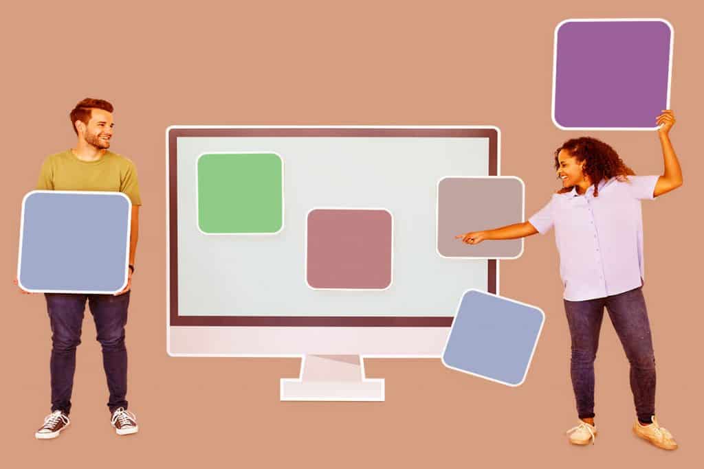
3. Use Contrasting Colors
Contrasting colors would always bring you the maximum eyeballs. If you want to grab the user attention, making use of the contrasting colors would be the finest technique you can avail. Well, contrasting color doesn’t denote an obnoxious color. You can create a contrast in various diverse ways.
A bold color in the background supported by a neutral color on the CTA or the texts would create the maximum impact on the users’ mind. However, you also need to follow the color psychologies such as using lime green or electric blue would not be pleasing for your eyes.
Another trick of nurturing a great CTA is by using such a color that cannot be found elsewhere on the site. This will certainly represent the CTA button as something special and worth notice in front of the readers. However, you need to make sure that the color isn’t striking too much visual discord. In order to effectively do so, learning the color psychology and color wheel would help you tremendously with the knowledge of the color complementation.
4. CTA Button Should be Large Enough
It’s obvious that you want your CTA to be displayed in the most viable way possible. Basically, your website’s CTA is the invitation to the individuals to take the next step and also, it should be the element where you want your website visitors to focus on.
Your entire screen should not be taken over by the CTA but the button should grab the visitors’ eyeballs. One great way of having the attention driven to you is by choosing a unique font for the CTA text. The unique and different font would be captivating enough for the users to take an action.
The texts you write on your CTA would have a great impact on its success. The attractiveness of the CTA texts should bring more eyeballs and more action. Suppose, “Subscribe Now to Get a Free eBook” seems more attractive than a dull “Subscribe Now.”
5. Put Offers Above the Fold
What do you think your visitors would do when they land on your site? They would have a look above the fold of your website. The above the fold is the top visible part of your website’s homepage on their screen. So, they would judge your site based on that above the fold. Now, it’s your duty to make it as captivating as possible. You also need to put the most relevant and exciting offers on the section so that it can be converted.
Now, if you bury your offers below the fold, the chances of visitors skipping your website without even looking at the offers are greater. They would come on your site and find it unworthy right after discovering nothing interesting above the fold. So, when you put your best offers above the fold, the chances of conversion definitely go higher. However, you need to be cautious that you are not making use of too many offers as that would clutter your homepage and the visitors will be lost!
Wrapping Up
Your homepage is the most valuable asset of your entire website. The homepage determines whether or not a visitor would stick to your website or not. We have given you two of the most viable examples of the homepage design. Furthermore, we have also provided you with the reasons why you need a well-designed homepage along with the tricks to design the homepage in the best way possible.
But there’s a catch (there’s always a catch)! How do you know that the copywriting, design, fonts, visuals, and the colors will suit your website and take it to the success? Well, you don’t know the perfect method. In that case, testing different versions of your homepage design would be the best way to determine the best for you. A/B testing can be a noteworthy technique to compare two versions of one page.
So, follow our directions and create your homepage accordingly. Write us back with your feedback. Do inform us whether or not the article has helped you improve your homepage and whether you are generating better revenue.